Pantone 2018’in rengini açıkladı!
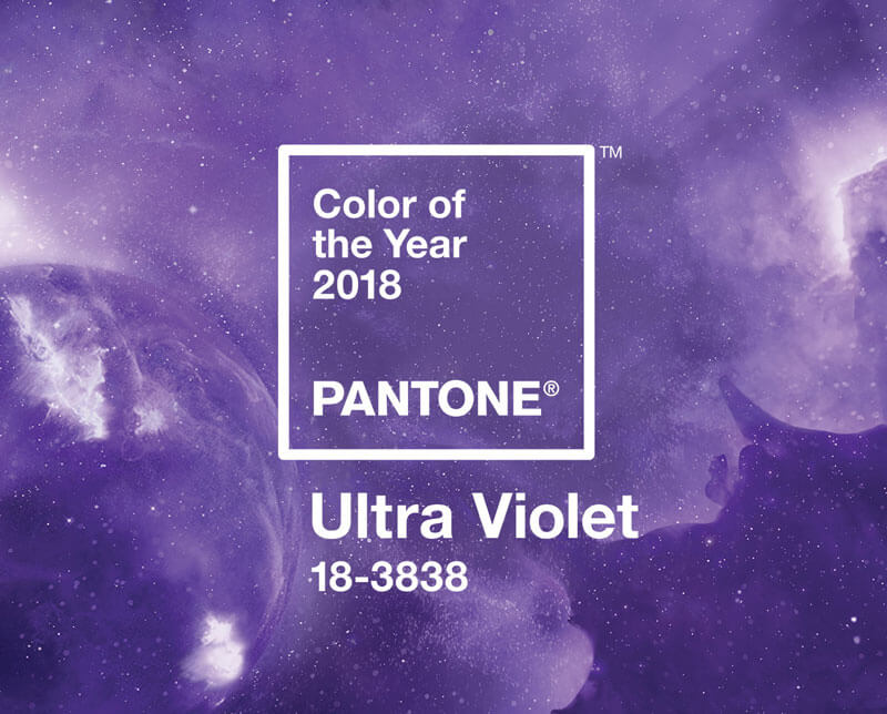
Dünyanın bütün renklerini bir araya getiren Pantone, her yıl olduğu gibi 2018 için de öne çıkması beklenen rengi belirledi. 2017 yılı için yeşil (greenary) rengini seçen Pantone 2018 için ise morötesi rengini belirledi. Belirlenen renk katalogda 18-3838 TCX kodunu aldı.
A dramatically provocative and thoughtful purple shade, PANTONE 18-3838 Ultra Violet communicates originality, ingenuity, and visionary thinking that points us toward the future.

Complex and contemplative, Ultra Violet suggests the mysteries of the cosmos, the intrigue of what lies ahead, and the discoveries beyond where we are now. The vast and limitless night sky is symbolic of what is possible and continues to inspire the desire to pursue a world beyond our own.
Enigmatic purples have also long been symbolic of counterculture, unconventionality, and artistic brilliance. Musical icons Prince, David Bowie, and Jimi Hendrix brought shades of Ultra Violet to the forefront of western pop culture as personal expressions of individuality. Nuanced and full of emotion, the depth of PANTONE 18-3838 Ultra Violet symbolizes experimentation and non-conformity, spurring individuals to imagine their unique mark on the world, and push boundaries through creative outlets.
Historically, there has been a mystical or spiritual quality attached to Ultra Violet. The color is often associated with mindfulness practices, which offer a higher ground to those seeking refuge from today’s over-stimulated world. The use of purple-toned lighting in meditation spaces and other gathering places energizes the communities that gather there and inspire connection.
About the Pantone Color of the Year
“The Pantone Color of the Year has come to mean so much more than ‘what’s trending’ in the world of design; it’s truly a reflection of what’s needed in our world today.” – Laurie Pressman, Vice President of the Pantone Color Institute.
As individuals around the world become more fascinated with color and realize its ability to convey deep messages and meanings, designers and brands should feel empowered to use color to inspire and influence. The Color of the Year is one moment in time that provides strategic
direction for the world of trend and design, reflecting the Pantone Color Institute’s year-round work doing the same for designers and brands.
Pantone Color Institute
The Pantone Color Institute is a consulting service within Pantone that forecasts global color trends and advises companies on color in brand identity and product development, for the application and integration of color as a strategic asset. Recognized around the world as a leading source of color information through seasonal trend forecasts, custom color development, and palette recommendations for product and corporate identity, Pantone Color Institute partners with global brands to leverage the power, psychology and emotion of color in their design strategy.


